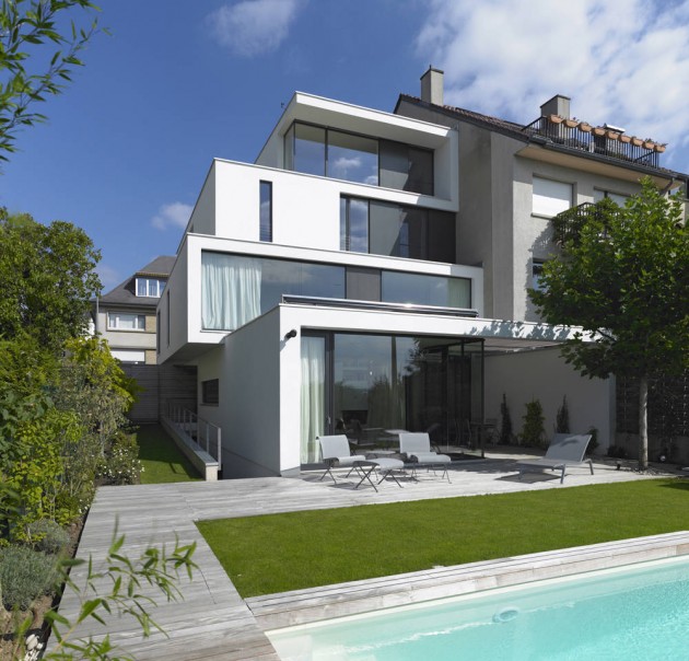
This lead to a complex massing characterized by cantilevers
and large recesses acting as generators of the architectural form. Displayed as
white volumes extended by strong horizontal and vertical lines, the composition
appears very geometric, while drawing an elegant flowing from the ground to the
roof top. Very expressive, the cornice becomes the element of integration to
the architectural typology of the street and the neighboring houses.
These lines and volumes are more than parts of the facade
conception. The 3-dimensional composition as well as the repartition of the
voids and masses invite the eyes to wander all over the building comprehended
as the whole.In the same way, the different internal spaces overlap: i.e. between circulation and living spaces, or between the different levels. The double height of the dining room connects the living areas of the ground floor to the study in the mezzanine and the parental suite on the first floor.
These facade and indoor interactions are completed by outdoor connections with the green spaces – terrace, garden and pool – thanks to large span glass openings.
An outside courtyard on the ground floor, laid out between the dining room and the living room, generates a very strong interpenetration between inside and outside: the garden with its swimming pool and the wooden decks get into the house!
This courtyard encircled by a portico and fitted with a velum is experienced, depending whether the large sliding windows are open or closed, as an outdoor space being part of the garden, or as an indoor space being part of the house.
The space of the house itself and the noblest living spaces are changing according to seasons and ways of life.
Once again it is the drawings of the lines and the white volumes that confer coherence to these complex and mixed areas of the house and its garden.
A special attention should be paid the principles of low energy construction that could be integrated to this complex and daring volumetric composition, which optimizes the openings to the south and west, and favors a more massive composition to the north and east , while giving a today’s coherent and relevant impression.
Visit the website of Steinmetz De Meyer Architects – here.
Photography by Christof Weber


